
Join us in finishing the Layers Mapping Project.
Answer questions like:
- Where is the nearest multiplier to a contact?
- Where are the active groups?
- Where are new contacts coming from?
- etc
More about this project
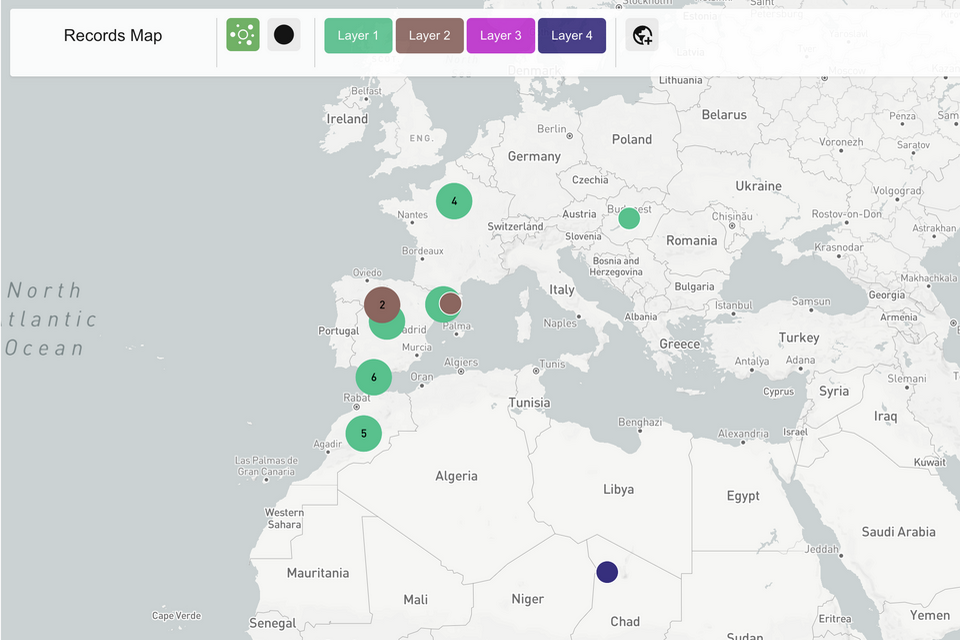
Pick and choose what data you want to display on the map as different “Layers”.
For example you can add:
- Contacts with the Status: “New” as one layer.
- Contacts with the “Has Bible” as another layer.
- and Users as a third layer.
Each layer will show up as a different color on the map allowing you to see different data points in relation to each other.
Invest today!
Help us reach the goal of raising $10,000 for this feature: